 Today Joel Spolsky had an odd recommendation: "don't hide or disable menu items." His reasoning is that user see disabled menu items and are confused as to why they can't click on them. So, rather than disabling the menu item, he suggests the following:
Instead, leave the menu item enabled. If there's some reason you can't complete the action, the menu item can display a message telling the user why.
Yikes. It's really better to leave all the menu items enabled and pop up annoying error messages (which people probably won't read) about why y ou can't click it? No, no, no. There's nothing more annoying when you're trying to figure out how to do something than to click on one menu item after another only to be told you can't do that. I'd much rather have my options narrowed down to the ones I can use.
My recommendation: If the user can't use a menu item, disable it and, if possible, add hover text explaining why it's disabled. Avoid error messages, as users get angry and confused at them. If being able to use a MenuItemA is dependent on enabling SettingB, keep MenuItemA enabled and tell the user "In order to do A you have to enable B. Would you like to do that now? Yes | No."
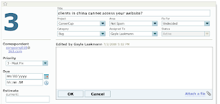
Interestingly, he doesn't even follow his own advice with his product FogBugz:
- Screenshot #1 - Disabling Menu Items: The "Status" field is disabled because I'm in "edit" mode. Right. I don't know why I would have expected to be able to edit the status while editing the bug .
- Screenshot #2 - Hiding Menu Items: When you go into "Resolve" mode, you can now edit Status. Oh goody. Wait, how come my only options are "Responded", "Won't respond", "SPAM", etc? What ever happened to good ol' fashioned "Fixed" and "Working on"? Ah, of course. I have to go back to Edit Bug, change Category from "Inquiry" to "Bug", Save, then go to Resolve. Now I can see other options for Status. Makes perfect sense...
Incidentally, due to UI issues like this, I'm now using Google Code for the bug tracker for CareerCup.